Bigger screen required!
Hi! Thanks for visiting our website, two quick things:
1. LiterOCULAR is intended as a reading framework with
rich functionality and interesting design. Unfortunately, this means screens smaller than a medium-sized
tablet won't work
very well, so we prevent access from
these devices. Please come back on a tablet, laptop, or desktop.
2. Chrome is the best browser which to view the site, though it will also work in Firefox and
Safari with some slight stylistic inconsistencies. No idea about Edge because, honestly, who cares?
This documentation rules the nation, with version
⚠️ Please note this documentation is best viewed with the base theme. Click here to switch. ⚠️
Source articles for the Death And Rebirth issue were taken from a personal archive of MF Doom features and interviews downloaded following his death in late 2020. Text was extracted using the pytesseract Python library, and then manually cleaned up. Images were extracted via Photoshop.
Source articles for Who Watches the Admen? were manually scraped and cleaned up from the source code at MIT Review, The Washington Post, and The New York Times.
The topics of both issues were chosen for their historical and specific differences, as well as for their close relation to our personal interests and field of study in the Digital Humanities. Death And Rebirth documents the artistic evolution of Daniel Dumile from his time as Zev Love X within the group KMD to his rebirth as MF Doom following the death of his brother Dingilizwe Dumile. Who Watches the Admen? details the controversy around the sudden departure of Timnit Gebru from Google's Ethical AI team following the publication of a research paper she co-authored. Each article within these issues was chosen to give a range of perspectives on its subject with some cross over between both issues in the case of more specific topics such as identity and representation.
Following the specifications for this project, the articles were formatted for metadata
extraction and reference at the article-level
(source, byline, publication date) and at the fragment-level with topic-specific metadata. We
chose to give the raw html for each article a
common layout: titles in h1 tag, subheaders and bylines with their own specific
class, and the rest of the text in p tags. We added figure and
blockquote tags as necessary to handle images and pull out quotes. We also kept
external embeds when possible (a video in The Washington Post article was removed as it
went offline during development) and either left them in the text itself or put them in modals
when they couldn't easily be restyled due to using iframes. We also spent time reflecting on the
content to decide what
should be formatted with specific span tags for article- and fragment-level metadata
usage.

These span tags include ID attributes, which we ended up not using but have kept for
potential future development, a class instance of mention-*, where * would stand for
the topic the fragment refers to, and an about=”*” attribute, where * would refer to
a specific entity within the topic. This system, which was implemented partly by hand and partly
through regular expression matching, was designed to then plug into the dynamic functionality
requirements of the project: the classes would allow for population of article-level topics (e.g.
technology) while the attribute would allow for population of specific instances of the topic
(e.g. Artifical Intelligence).
After a first round of formatting we had a set of article-level topics for each issue (e.g. person, subject, organization etc...) which allowed us to evaluate the main themes, decide how to handle abstract topics, and decide on whether or not to merge / remove certain entities for clarity and focus. In the end we felt that there would be benefits in being able to view closely connected topics (such as the different aliases of Daniel Dumile) alongside each other and so decided against merging entities.
Not gonna lie, we spent a fair amount of time feeling like this while contemplating the
functionality requirements for
this project:
Early on we decided to use the following line from the spec as an overall guiding principle when approaching the underlying design of the magazine: "The canvas should be exactly as big as the viewport. Individual articles and metadata viewer will scroll autonomously within the overall canvas."
As a result we locked the canvas of the issue page to viewport dimensions, 100vh/vw and position:fixed, and the issue page was given a position:relative with 100vh to account for browser window reszing and additional bars that might reduce visible canvas. We then spent some time
deciding the best approach for the metadata viewer, finally settling on using Bootstrap's
offcanvas functionality and placing the viewer on the bottom half of the screen with a height of
85 to enable us to have as much space within it as possible. This choice did end up affecting
another part of the spec, namely our ability to enable clicking on a fragment within the metadata
viewer to auto scroll to its position within the article. As the articles are partially covered by
the offcanvas while browsing the metadata viewer this would have required a fair amount of hoop
jumping via scripts that we felt was too complicated and with too many variables for a smooth user
experience. Furthermore, due to most topic fragments
having multiple instances, auto scroll to first instance with the viewer retracted felt somewhat
pointless as the user would then have no way to continue flipping through each topic instance.
We justify this choice, as well as others detailed in this documentation by referring to another part of the spec which we also used as a guiding principle: "design deliberately."
The home page was laid out with a fluid container to tap into the viewport logic governing the
project (see below for more detail on this). This container was then split into two columns: the
left one acting as the cover / editor's letter and the right one acting as a ToC. They were
proportioned to emphasise the cover and their columns were set to medium breakpoint to ensure
consistency across all supported device sizes (see below for more on that). The ToC uses gutters
and margins of 0.5rem. The issue page is essentially a navbar and three columns split
equally across the Bootstrap grid, with 0.5rem of padding on the containing row to
ensure that functionality, design, and legibility aren't compromised.
The decision to adhere to the canvas lock also led us to decide that no part of the magazine
should be scrollable aside from the articles themselves (using the CSS overflow
property with scrollbar hidden by default) and the modals. In essence, we made the
design decision that this magazine would be constrained in a similar way as print magazines were
by their choice of paper size. Therefore we made all additional page requirements (disclaimer,
about, documentation) modals and designed the cover/content page to fit within the viewport at all
available sizes (see below).
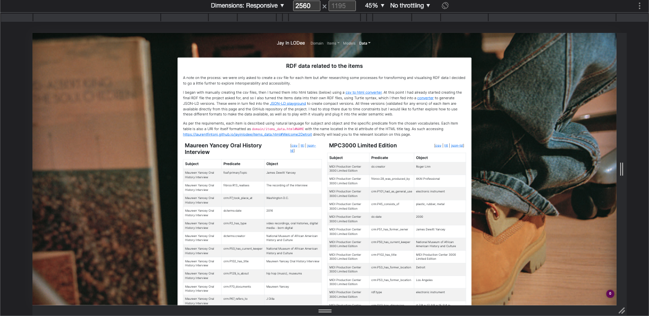
One last but important note regards typometry and the baseline measurement of
every element in this magazine. We started designing LiterOCULAR using rem as the
base relative unit, for two reasons: it is the unit used by Bootstrap's core css, and it
simplifies nesting declarations. However, once we'd gotten deeper into the various
historical designs we made the decision to switch our base relative unit to vw. This
was due to the fact that when viewing the magazine on higher resolution screens, Bootstrap's
framework can lead to an overall shrinking/stretching of the design within the canvas (see
screenshots).
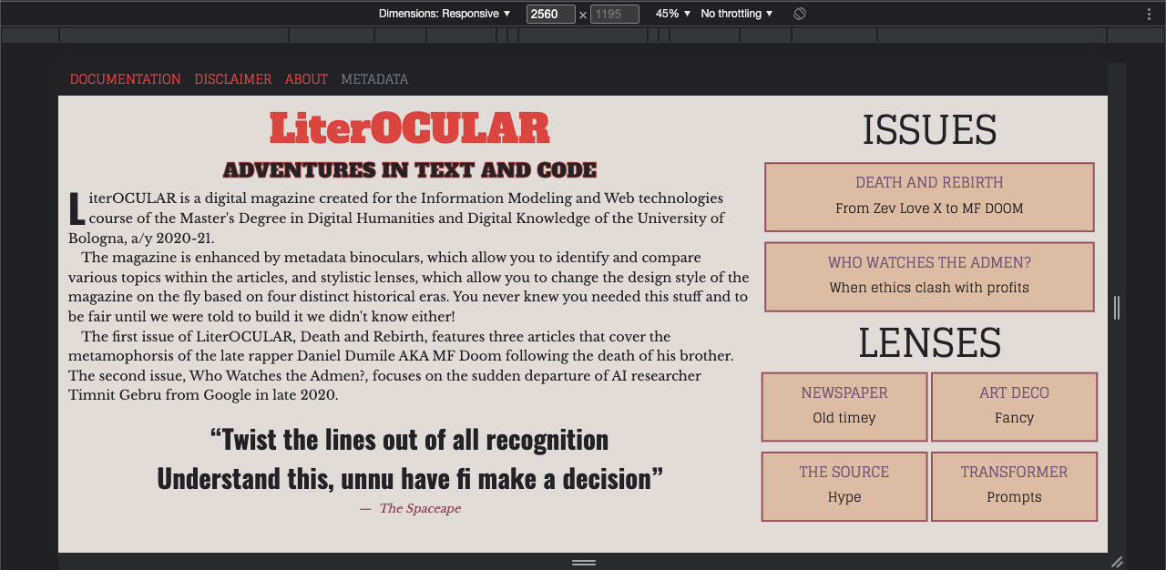
While experimenting with some design ideas we realised that by changing all the necessary base relative units in our css as well as overiding key elements in the core css we could have a design that scaled relative to screen resolution. As there is no such thing as a clean answer in web dev — 😆 — we then realised that this approach meant that once you went below a tablet in device size you encountered the opposite problem: the device's smaller width lead to everything being relatively too small to be readable or usable. One option to get around this would have been to script a calculation function to change the base relative unit in the css based on device so that anything below 768 would revert to px or rem and anything above the most common resolutions for desktop and laptop used vw. As the decision to switch to vw was made relatively late in the development process (keeping it 💯 it was Laurent who made that decision in a CSS-induced fever and essentially put Federico in front of it as an accomplished fact 🤫), by which point we already had a lot of scripts already implemented, we decided to instead block access to the site for any devices below 768. Furthermore anything smaller than a tablet makes the experience of content-focused interactive sites such as this difficult without a full rethinking of the layout. Again, we justify these decisions by invoking the "design deliberately" principle.
With the metadata viewer being a central part of the spec we also spent some time deliberating
the best way to approach its requirements. In the end we settled on a design for the viewer
that imitates that of the issue page: three columns. The offcanvas is separated into three
rows: header with title and controls; issue-level metadata and usage instructions;
and article-level metadata. The latter is in turn split into three columns containing a series of
accordions populated by the article's topics (titled using the mention-* class). Each
accordion gives the user access to all topic instances (titled using the about=”*”
attribute), and selecting a topic instance will highlight it across the article. Lastly, each
topic instance auto-generates a Wikipedia search via a split button. Both the accordions and
topics within are presented in descending order of density within the article. A reset button
enables the user to remove their chosen highlights and start again.
Considering our design choices for the skeleton of the magazine we felt this approach allowed us to fulfill as many of the project's requirements as possible while also taking an approach aligned with the primary purpose of a magazine: reading.


If the functionality requirements of the spec left us feeling like the thinking equations meme, then the design requirements of creating four different historical CSS themes left us feeling like Dawson. Still the only choice was to embrace the pain and let it make us stronger, like Vegeta.
Based on the requirements we decided on the following four themes:
- 19th century: Newspapers
- 1900-1950: Art Deco
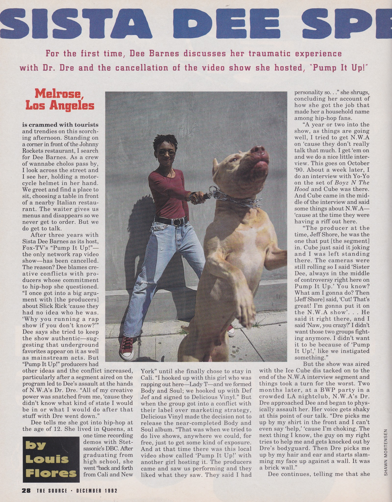
- Late 20th century print: 1990s hip-hop magazines
- 2030s: Promptism
Having created a core css to handle the rules that would be needed regardless of stylistic theme (such as canvas lock, offcanvas positioning, switching animation etc...) we then created each individual theme separately and built a functionality that would load a base theme by default and substitute it for the relevant historical one when selected via the ToC or navbar menus. We also made the choice to use a simple CSS animation, featuring the three primary colors of the base theme, to hide this switch and make the user experience more pleasant.
As with all other main steps of the development of this project, CSS theming was an iterative process. We began with a base theme, then created initial versions of both the Promptism and Newspaper themes. However, it was during the creation of the Source theme that we refined and improved our approach and made several decisions that were then rolled out to all other themes ensuring a consistency that reflects the relevant historical periods without creating drastic changes on the content. This decision was a by-product of a last key guiding principle we had settled on: the content should the focus of this magazine with the design requirements a complement to it.
The decisions that were made at this point and further refined in each theme include: switching
to vw as the base relative unit, splitting
the navbar contents between both pages, using the navbar brand as a home button with its own
specific font, applying
consistent and historically inspired styles to computer interactions (such as hover and focus),
replicating historically accurate layout touches, and consistent usage of a selection of fonts and
colors for each theme.
With regards to fonts, dropcaps, indents, and padding sizes around text and images these were drawn from our historical references and replicated using visual estimation in the spirit of the spec's requirement to update historical elements. Dropcaps were eyeballed using sentence heights and indents using letter length. While dropcap heights did vary historically, we found that the indent length was roughly the same across all three themes that use it and so kept it the same. All fonts are taken from GoogleFonts aside from three in the Newspaper theme. This is due to some issues we were having with loading local fonts outside the Newspaper theme, and so decided to pick up the challenge of finding everything we needed solely in their collection.
The entire CSS process is best summed by another two memes (like all good things in life): procrastination and bug squashing.

🎨 (base) #111 + #f4f4f4
🎨 (spot) #D2042D
✍🏻 Roboto Slab (headers/branding) | Lato (body) | Ubunto Mono (menus, quotes)
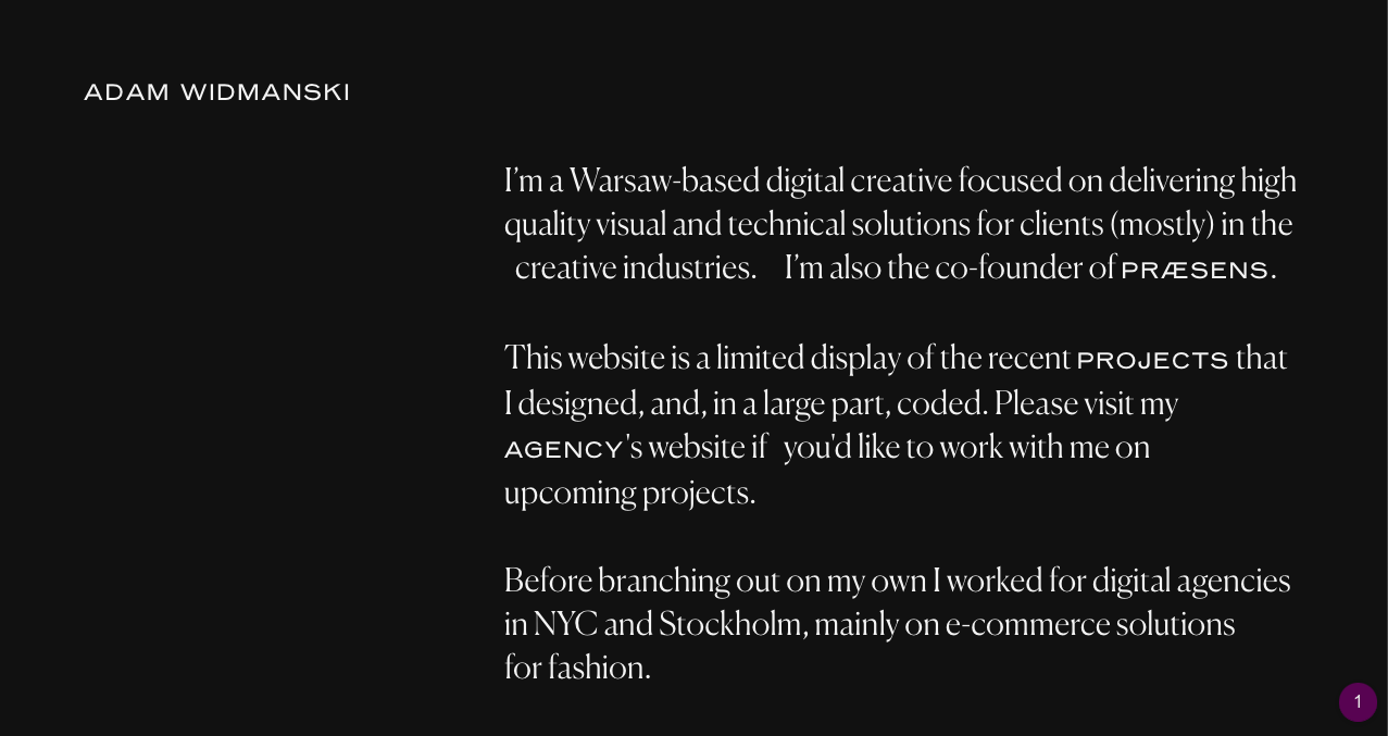
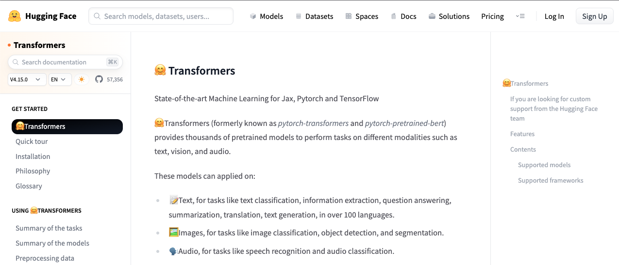
Inspiration: The base theme was first thought of as a take on the greyscale aesthetic of current website design. In particular this site was used as an early point of reference following some research. The idea was that by keeping the base theme simple it would contrast nicely with the historical themes. Eventually this approach was rethought as the Promptism theme adopted a black background with white text and the Newspaper theme had potential for greyscale. In the end we kept the white/black balance (#111 and #f4f4f4) and desire for mininalism but ditched the original use of greys as spot colors and instead used a cherry red highlight (#D2042D) that offered a perfect contrast. Inspired in part by the way in which modern sites make use of emojis to enliven navigation and reading, we decided to add them to article headers, byline, and cover/ToC as a visual cue signifying the theme's location in the current moment.
Fonts: Roboto Slab was chosen as an ideal header
font that would complement a sans-serif body font like Lato, which has a self-effacing simplicity.
Another option for the body would have been to use Roboto but we wanted to try something a little
different. Ubunto Mono was chosen for its contemporary style and the way in which its fixed-width
would contrast with the other fonts.
Layout: The idea was to keep the layout simple so as not to distract from the historical themes while offering a sense of playfulness that would invite the user to delve into the site's wider functionality and purpose. We repurposed Bootstrap's inbuilt functionalities, such as cards on the homepage mimicking buttons. We also decided to align headers, subs, and bylines to the right for a simple contrast with the other themes.
🎨 (base) #111 + #ebe7dd + #f4f4f4
🎨 (spot) #f9eac8 + #353434 + #4a1520
✍🏻 Chomsky (branding) | Old Newspaper Type (body) | Chunkfive (menus) | Newsreader (titles)
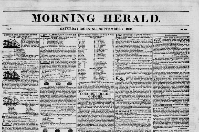
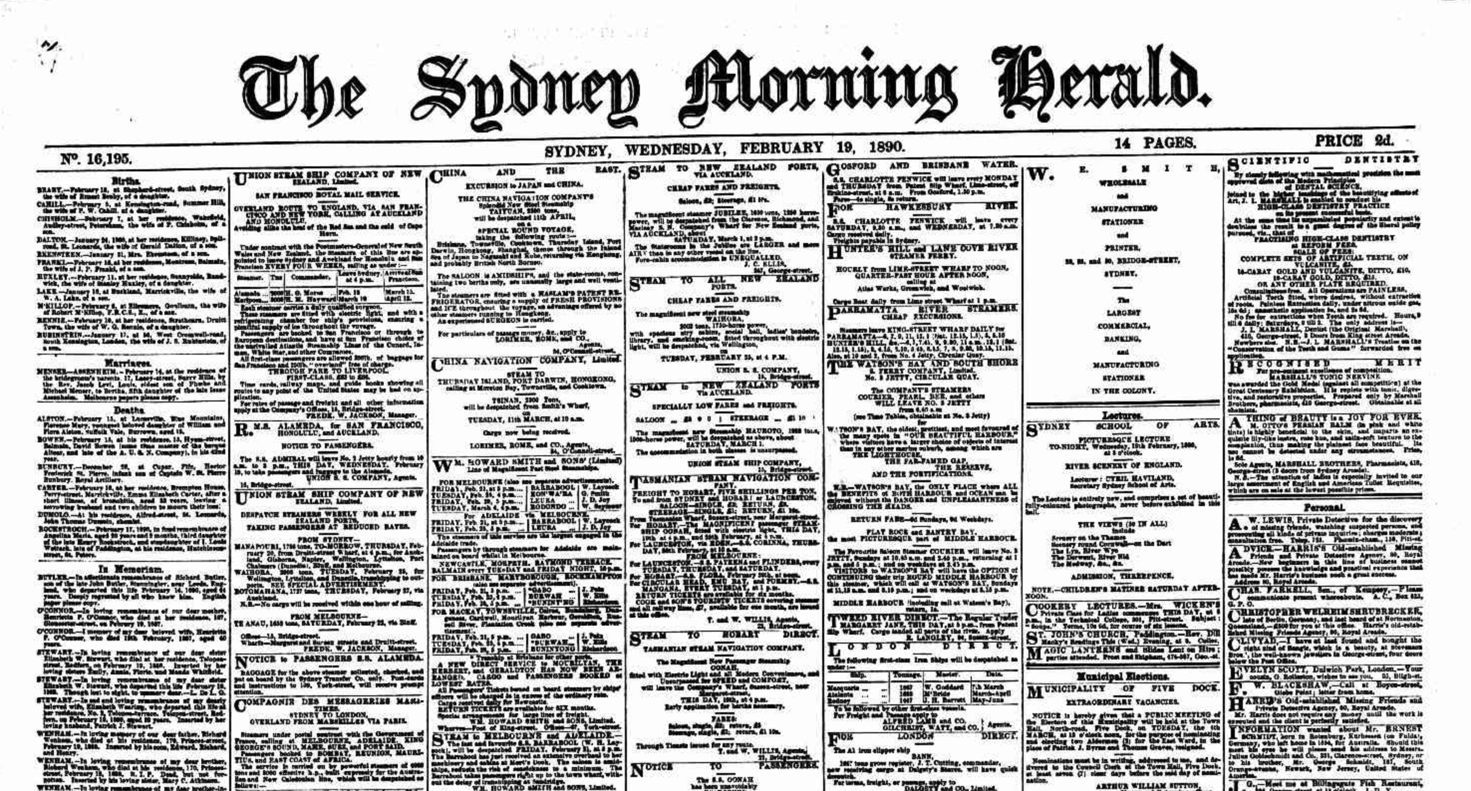
Inspiration: For the Newspaper-inspired theme we turned to Guilty Novin's exhaustive article for inspiration as well as a collection of 19th century newspapers from the USA available at the Library of Congress. The typical layout of newspapers of the time was already preserved with our use of columns for the magazine skeleton and we focused on picking up some of the quirks and details of the time (an approach that was repeated for all historical themes). While we originally thought that this theme would make use of dropcaps, upon closer inspection of the LoC collection we noticed dropcaps only appeared to be used for classified adverts rather than articles themselves. For the color palette, we settled on a yellow-ish gray for the background (#ebe7dd) and a slightly toned-down black (#111) and white (#f4f4f4) for text, in order to maintain high contrast and legibility. A light shade of yellow (#f9eac8), a dark gray (#353434), and a dark shade of pink-red (#4a1520) were chosen as spot colors for drop down menus, buttons, and highlights. Images were greyscaled via CSS filter to align them with the overall historical feel.
Fonts: The easiest font to choose was the
magazine header/title font, Chomsky: it looks just like 19th century newspaper titles.
Next, we needed to find a fitting font for both body and headings: after unsuccessfully browsing
multiple sources while comparing typefaces with our historical sources, we stumbled upon a font
called Old Newspaper Type. It was freely available and in open format, and the deed was
quickly done. The search for a heading font was a multi-step process: we initially used Chunkfive
for both menus and textual headings, but quickly realized it wasn't historically accurate for
article content. We opted for keeping Chunkfive as an extension of the theme in menus and
interactive components, which clearly didn't exist at the time, and to use a more plain-looking
typeface called Newsreader for article headings. This is also the only font for the newspaper
theme found in GoogleFonts.
Layout: Bottom margins were removed from
p tags, margins and padding were adjusted elsewhere (images, titles, menus etc...),
and text alignment was set to justified to emulate the condensed feel of the layouts of the time
as well as some their peculiar distortions. Solid, light lines were used to emulate the
demarcations and boxing of the time while a pointing hand was repurposed via Photoshop from a 1839 edition of the Morning Herald as a nod to the way in which newspapers
of the time made use of icons to enliven their layout and draw attention. Lastly, rounded edges
were removed from all boxes as they were not historically accurate.
🎨 (base) #111 + #fff
🎨 (spot) #68A469 + #6F1946
✍🏻 Limelight (branding) | Prata (body) | Cormorant Garamond (menus) | Poiret One (titles/quotes)
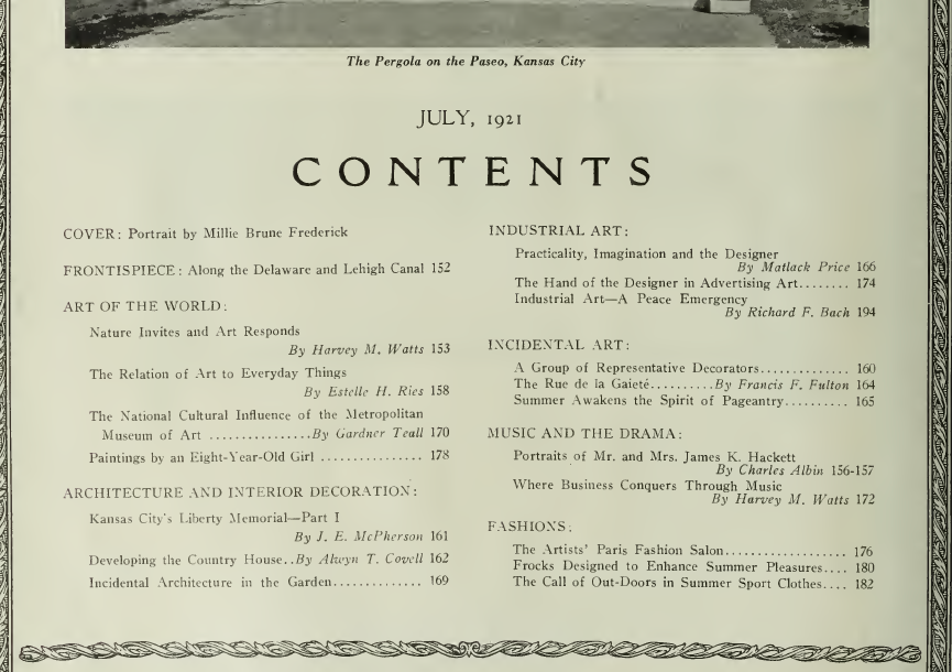
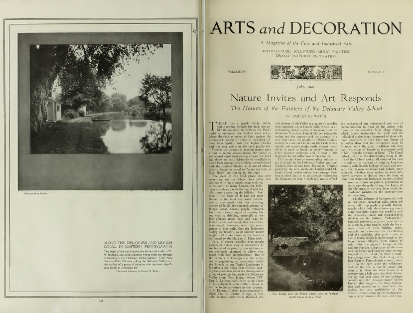
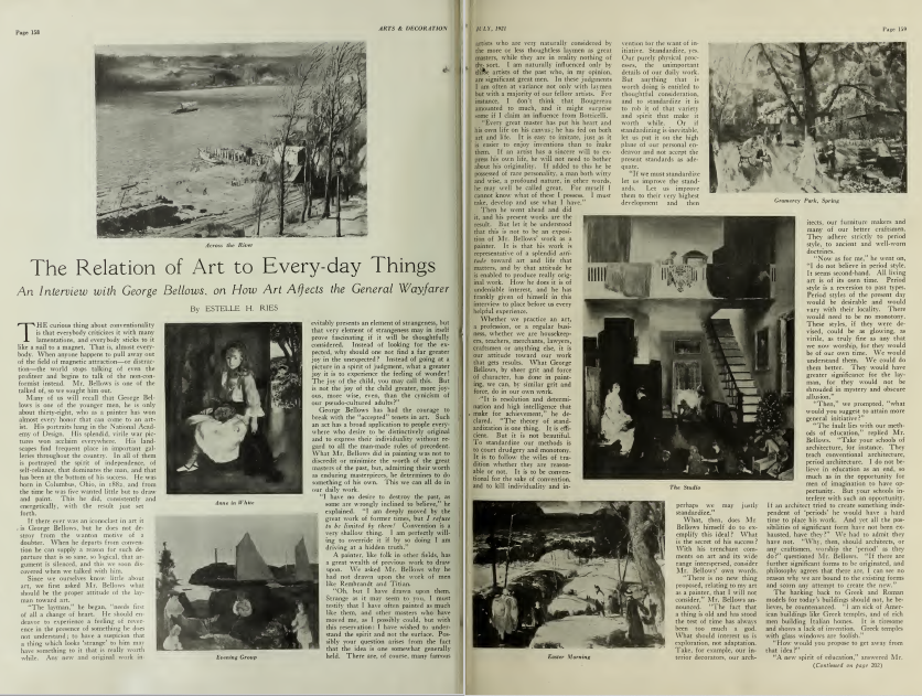
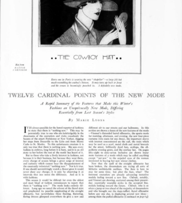
Inspiration: We chose Art Deco as it is an early 20th century style more readily associated with architecture and material design than print, which we felt would be more interesting. After some research we honed in on two options: the more flamboyant aesthetic typical of posters of the era or the more subdued but still striking aesthetic of key print publications, namely Harper's Bazaar from NYC and Arts & Décoration from Paris. We chose the second as more realistic to achieve. Time wise we pulled from the first half of the Art Deco movement, before WWI, with references to a 1925 issue of Harper's Bazaar and a 1921 issue of Arts & Décoration, taken from the Internet Archive via The Online Books Page resource.
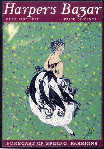
We chose to focus the colors on a simple palette. Black (#111) and white (#fff) for background and text, largely due to the fact that we already made use of a yellow shade for the Newspaper theme to imitate old paper and we were unable to ascertain the exact page color from the scans. White seemed a likely historically accurate choice, with color primarily kept for covers. A dark shade of magenta-pink (#6F1946) and a shade of green (#68A469) were used as complimentary colors, inspired by a Harper's Bazaar 1922 cover. The magenta-pink allowed for an interesting twist on background color for menus and metadata viewer while the green as a spot color was a nice reference to jade, one of the natural materials used in Art Deco designs such as jewelry and furniture.
Fonts: Limelight was an obvious choice for the
branding, with its high contrast, geometric style instantly evoking our current understanding of
the era. Likewise, Poiret One was chosen as another cursive, sans-serif font that easily evokes
the era and would be better suited to titling so as not to have titles become overbearing. Prata
was chosen for the body as it emulated the contrast between curves and serifs seen in our
reference magazines. After trying out Poiret One but finding it too light, we opted for
                        Cormorant
                        Garamond
as the menu type. It felt like a good emulation of some of the title fonts in our
references and also has direct historical relationship to the 1920s as it is an open-source
adaption of Garamond which itself saw a revival during that period.
Layout: One of the key layout elements we wanted to emulate from our references was the use of geometric figures and embellishments as borders and dividers. After doing some testing with images of historically accurate separators we opted to instead make use of CSS pseudo-elements as these can more easily scale. We stumbled on two useful bits of public code: a Codepen with various Art Deco inspired separators, and a StackOverflow thread with a simple double border frame. The latter was used for the ToC and the former to embellish the cover title and blockquotes with corners, diamond separators, and full frames. Returning to our references, we opted for double solid lines to frame the cover images of each article, with additional padding on the images themselves to emphasize the frame.
Based on our references, we centered headers, subheaders, bylines, and captions and added italics
to subheaders and captions and uppercase to bylines. Dropcaps were added to the beginning of each
article, followed by indents, both using pseudo-elements to control all the necessary instances
across the six articles (and modals) using *nth-child logic. Due to the differences
in some of the html
structures of the articles, we also had to create additional classes to ensure that dropcaps
and indents behaved correctly across both issues (this was in turn taken across to other themes).
The remaining
letters of the first word of each line were also uppercased following a dropcap as was the norm.
Bottom margin
was removed from paragraphs, and padding was kept around images in line with historical
references. We only kept rounded edges on the top corners of boxes (buttons, modals etc...) as
based on our references that appeared
like the most accurate use of rounded edges at the time.
🎨 (base) #222125 + #e1dcd8 + #DBBC9F
🎨 (spot) #d5473b + #70557D + #8c485f
✍🏻 Alfa Slab One (branding/titles) | Libre Baskerville (body) | Glegoo (menus) | Oswald (quotes)
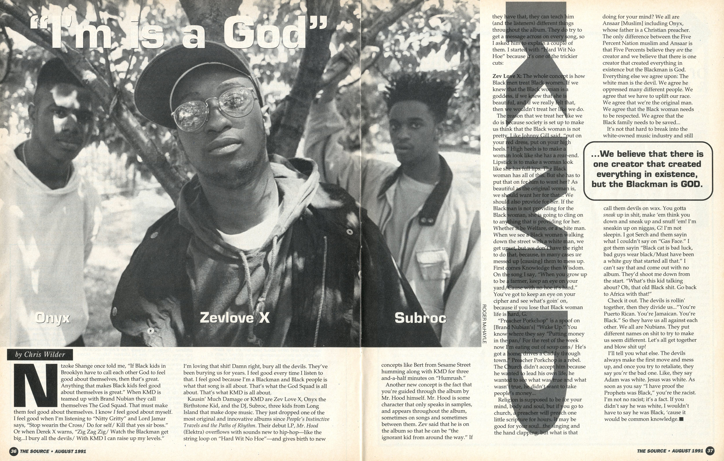
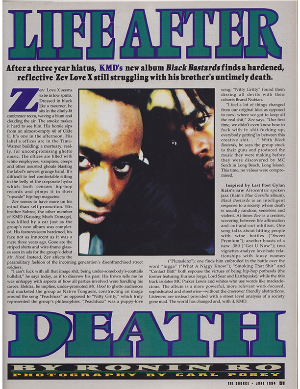
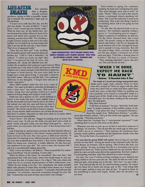
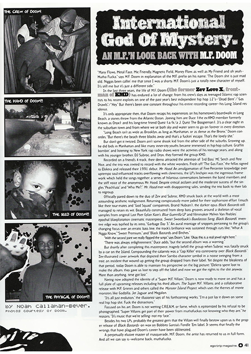
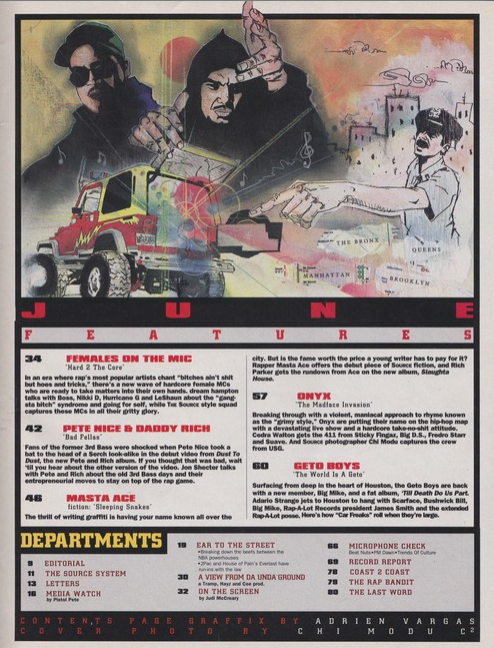
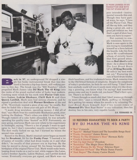
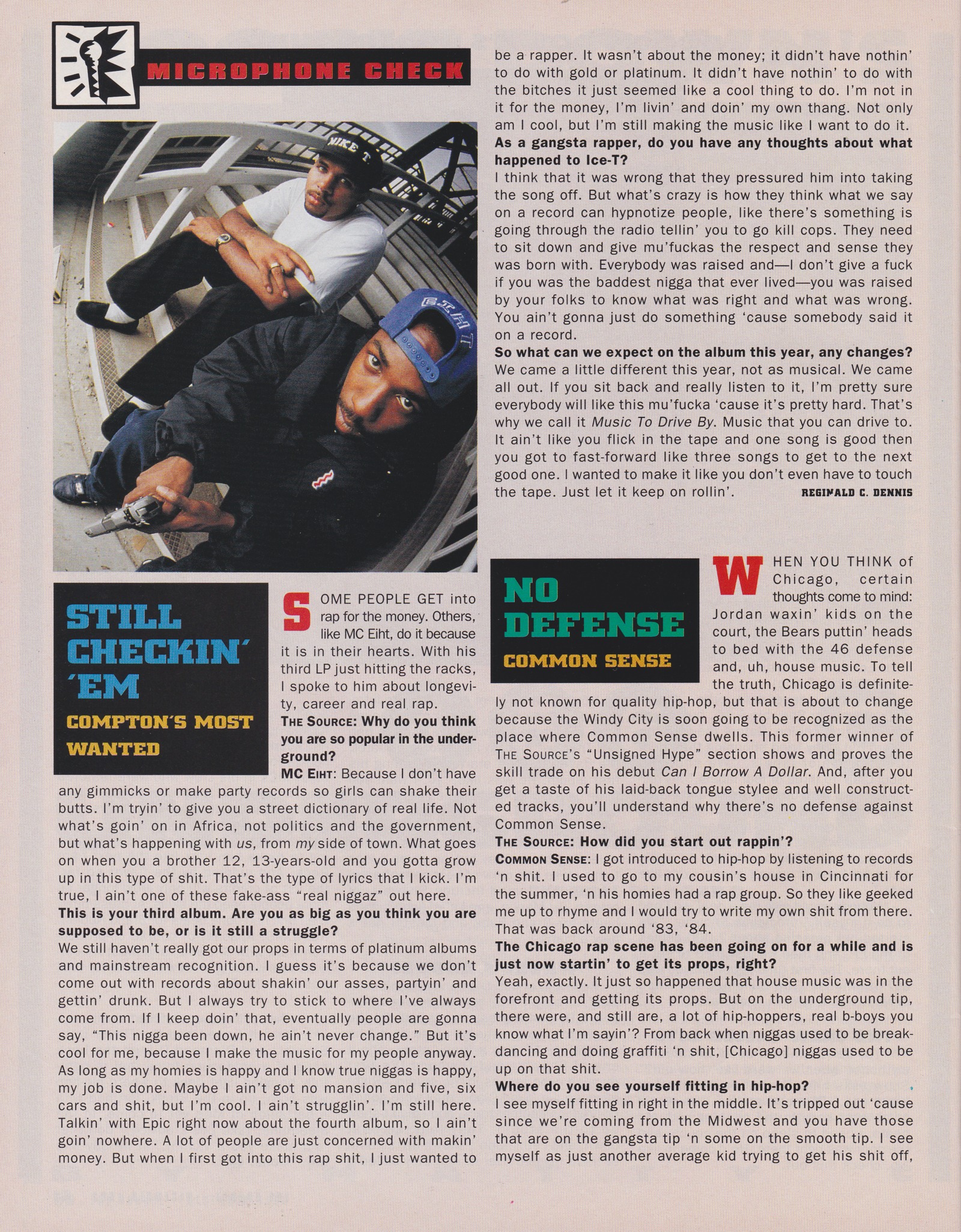
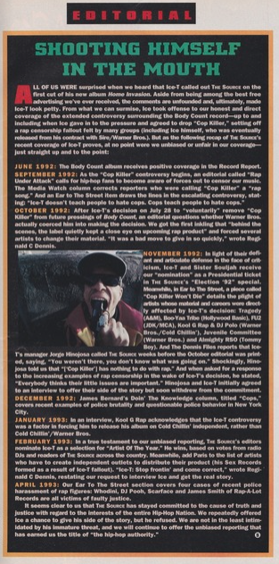
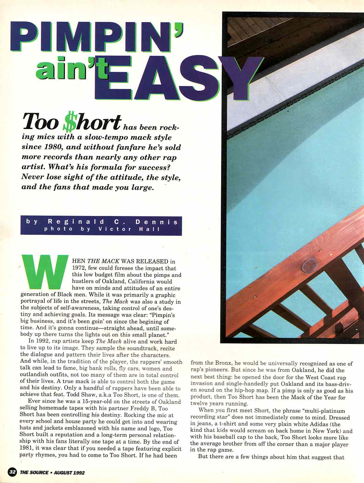
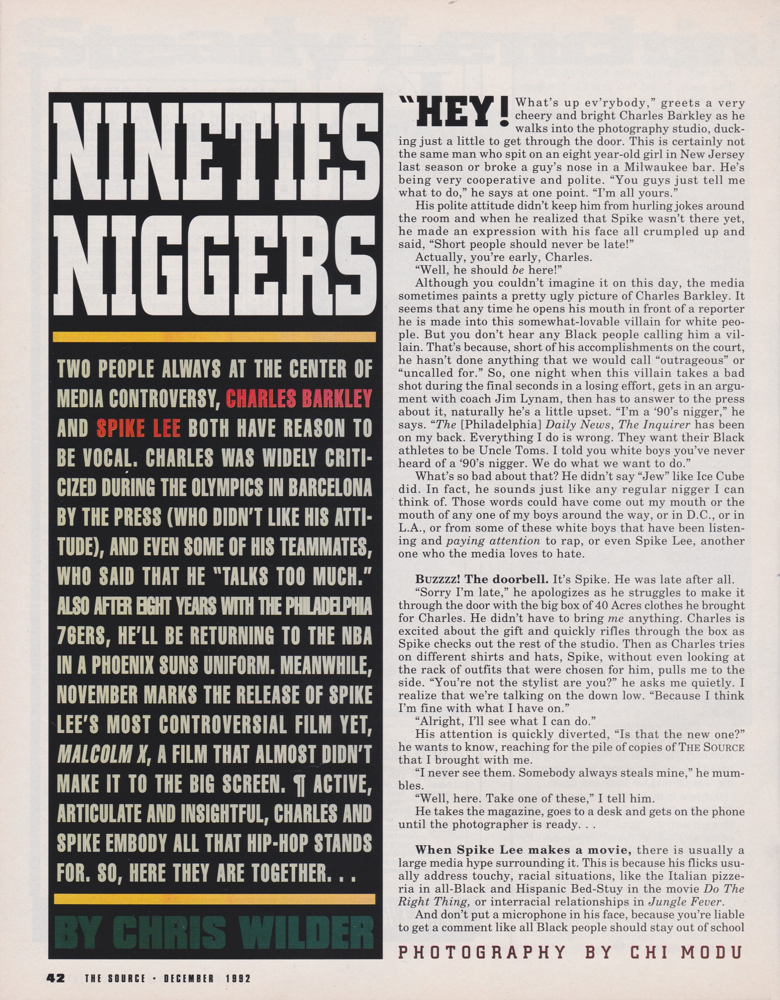
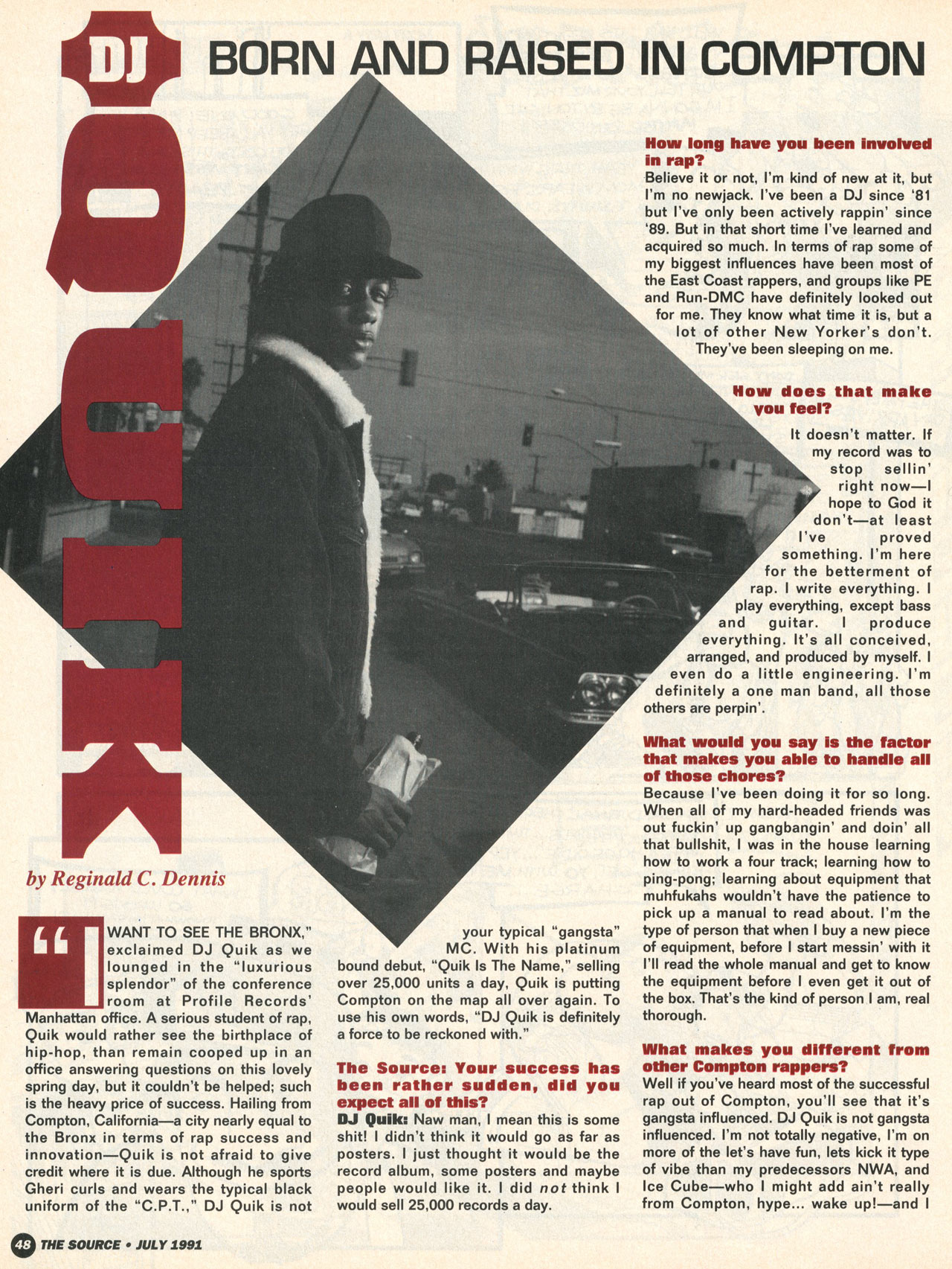
Inspiration: The choice of 1990s hip-hop magazines for this theme was clear from the beginning, as the articles of the Death And Rebirth issue were taken from issues of The Source and Ego Trip Magazine, two key US publications for fans of the music at the time. With access to a large personal collection of scans from publications of the time (XXL, Rap Pages, and Hip-Hop Connection among others) we first began to look for key aesthetic elements common to this subset of music magazines. While each of these publications had a certain style, there was an undeniable common aesthetic to hip-hop magazines of the time and we originally considered making direct references to different publications before ultimately deciding that The Source would be the direct reference, essentially speaking for all. Part of the reason for this was that we had access to many different Source articles as reference, compared with other magazines, and that it is historically one of the most important publications of this specific subset.
For our primary palette we decided on a very light shade of orange (#e1dcd8) as the main background color and a medium shade (#DBBC9F) for the metada viewer, modals, and buttons. This choice was inspired by some of the specific backgrounds in our reference documents, in particular a fact box that became the basis for the theme's boxes. Text used a very dark shade of blue-magenta (#222125) extracted from scans, which was also used for the navbar in the spirit of how content pages and regular columns were presented. For primary spot colors we used a shade of red (#d5473b) which was a common balance to the black in many issues as well as magenta (#70557D) and pink (#8c485f) for borders and highlights. The articles themselves feature additional color combinations in the titles, which was inspired by the way in which 1990s music magazines often called on a wide range of color combinations with each article often featuring its own specific palette.
Fonts: After trying to analyse fonts used at the
time and doing some research we settled on a combination that we think evokes the spirit of the
times. Alfa Slab One was chosen for branding and titling as an old-style serif with a strong
visual effect that brings to mind some of the title fonts used by The Source in its early
days. Oswald was chosen as a clean gothic sans-serif ideal for blockquotes and dropcaps, evoking
some of the extra bold sans-serif used at the time. Glegoo felt ideal for menus with its lighter
slab
serif evoking print in very clear ways. Lastly, Libre Baskerville was chosen for the body, as
serifs tended to be common in body text at the time (though there was a switch to sans-serif in
the decade) and it is optimised for body usage on computers.
Layout: The aim with the layout of this theme
was to try and capture how diverse the design of each article in The Source could often
be. Common
elements were chosen to tie it together, especially as we didn't have the luxury of multiple
pages: the use of uppercase for bylines and menus; straight corners; no background hover colors;
the use of a small black square to indicate the end of an
article. After this we opted to recreate the layouts of the three different articles in Death And
Rebirth as these were most directly related to our magazine. Each article has therefore been as
closely recreated as possible, with the 1991 Source article about KMD featuring a
different, but historically accurate, lead photo to allow us to recreate the title's positioning.
For the second issue, we drew from the color combination and design styles of Source articles from
1991 and 1992 including the use of image cropping (recreated via CSS clip-path
property thanks to this handy
resource), line boxing around titles, and color alternation. Subheaders within article were
also styled in homage of the times with solid background colors, center alignment and small
dropcaps and letter spacing to control their stretching across the available space. Lastly, bottom
margins were removed from paragraphs, an
underline given to bylines, and text justified.
🎨 (base) 🤷🏻♂️
🎨 (spot) 🤷🏻♂️
✍🏻 🤷🏻♂️
Promptism is a movement rooted in the technological advances of the 21st century that holds the potential to completely transform artistic practices. Promptism was founded in response to the growing concern that traditional art had become irrelevant to the modern world. Going beyond painting and sculpture, Promptist art involves the manipulation of new media, specifically computer generated imagery, animation, and the Internet. Its unique dynamism makes Promptism a dynamic vehicle for the expression of identity and the implementation of real-time feedback between itself and the spectator.
Inspiration: For our last trick we gave some serious thought to how best to approach the spec's requirement that one of the themes be an imagination of what the future of design might look like. Keeping it 💯 we're not fans of predictions, they just always seem so forced and rarely hit the spot (unless we're talking about speculative fiction but let's not go there because it's too depressing). One early idea was to mint an NFT and just make the entire website redirect to a blockchain entry, but we didn't have the money to be honest and it felt like too much of a cop out (still think it's funny in a conceptual art kinda way). Eventually we decided that it would be just as fun to use the current Promptist movement and advances in Machine Learning to generate most of the CSS code via prompts given to a GPT model: Eleuther AI's GPT-J-6B.
That's right, all of the CSS in this theme was generated from prompts with the model's suggestions refined and aligned to ensure the result wasn't too chaotic. The color scheme and fonts were picked from simple prompts of partial Google Fonts URLs and CSS properties and then we fed it the selectors we needed based on the default theme and continued along until we had something workable.
In addition, we also generated new versions of all the images in our magazine using VGAN+CLIP Colab notebooks. The cover images were generated based on source image and title as prompt using the CLIP Guided Diffusion approach by Katherine Crowson, while article images were generated with source image and title as prompt using standard VGAN+CLIP models.
The original idea was to have the entire site be generated by prompts, including the text, and we actually did generate alternate versions of each article but in the end finding a way to cleanly subsitute everything proved too demanding so we settled for simply swapping the images using Javascript.
While this theme started as a bit of a joke and pushback against the spec requirements, we do think that Promptism, as the current movement of machine-enabled art has been coined by some, offers a genuinely interesting take on what the future of art and content will look like. The Promptist Manifesto, written by GPT-3, can be read here.
This is not the content you are looking for
The purpose of this web site is to explore various types of typographic and layout style for text documents, as an end-of-course project for the Information Modeling and Web Technologies course of the Master's Degree in Digital Humanities and Digital Knowledge, University of Bologna, a/y 2020-21, held by professor Fabio Vitali.
The documents contained in this web site have been selected for their length and complexity. Their publication here is not intended to be an alternative or replace their original locations. The documents in the Death and Rebirth issue are taken from print copies of The Source magazine (1991, 1994) and Ego Trip magazine (1998). The documents in the Who Watches the Admen? issue are taken from The New York Times, the MIT Technology Review, and The Washington Post.
All copyrights and related rights on the content remain with their original owners. All copyright on the typographic and layout choices are 2021 © Federico Cagnola, Laurent Fintoni
Why would you do this?
It's a question we asked ourselves repeatedly during the process of completing this project. Sometimes the doing is the answer.
Built by @laurent_fintoni and @fcagnola over countless hours. Technically this makes us the editors, publishers, and designers of this imaginary magazine.